Advanced Typography/ Task 2: Key Artwork & Collateral
Natalie Chu Jing Xuan/ 0354589
Table of Content
- Lectures (All lectures documented in Task 1)
- Instructions (MIB)
- Task 2
- Final Outcome
- Feedbacks
- Reflection
Module Information Booklet
Task 2
Part A - Key Artwork
 |
| Fig.1.1 Visual References for Key Artwork |
I browsed through Pinterest and collected some of my visual references before I start with my sketches.
 |
| Fig.1.2 Sketches |
I decided to try out Sketch#1, Sketch#2 and Sketch#9 in Illustrator to see which one works better.
 |
| Fig.1.3 Process |
The three keywords for my wordmark are:
- Exploration
- Mystery
- Adventure
I started with digitalizing Sketch#1 and #2 which have the star elements.
The star fits perfectly because it stands for exploration, like discovering new places in the universe. It also has that mysterious vibe since it's so far away and unknown. Moreover, stars guide adventurers on their journeys, capturing the spirit of adventure.
Mr Vinod said that the start element is too common. Therefore, I decided to change to Sketch#9 which is inspired by the shape of maze.
In my opinion, the maze is a perfect symbol for life, representing exploration as we navigate its complex paths and unexpected turns. It embodies mystery, with each twist hiding the unknown and keeping us curious. Life itself is an adventure, much like a maze, filled with challenges, discoveries, and the thrill of finding our own way.
 |
| Fig.1.3 Printing of Initial Wordmark |
Fig.1.3 I was my original design, but when I tested it in printing sizes of 15mm x 15mm and 175mm x 175mm, it was barely visible on the smaller size. When I look at it from a distance, I think it looks like a black block. So I decided to thin the strokes.
 |
| Fig.1.4 Refinement of Wordmark |
Fig.1.4 shows the refinement of my wordmark. I rounded the edges from the left version to the right one to make it look less boring.
 |
| Fig.1.5 Construction of Final Wordmark |
 |
| Fig.1.6 Printing of Final Wordmark |
In this final version, the wordmark is visible clearly in both printing sizes.
Part B - Collateral
In order to turn the key artwork into a brand, we will be creating t-shirts, lapel pins, and other items, animation, as well as an Instagram account in this task.
Animation
 |
| Fig.2.1 Animation process in Illustrator (top) and Photoshop (bottom) |
 |
| Fig.2.2 Animation |
Collateral
First, I tried out many different colour palettes:
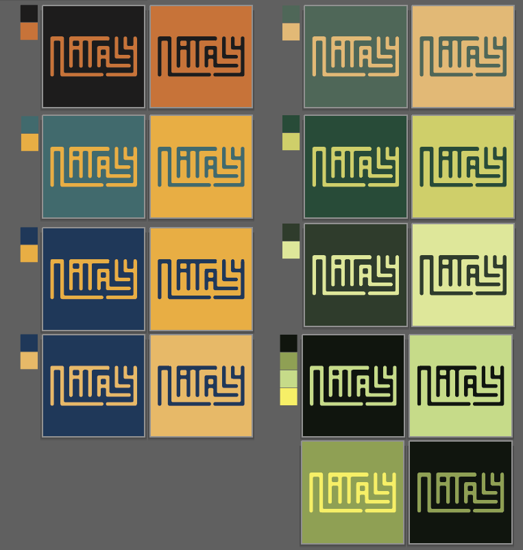 |
| Fig.2.3 Colour palettes |
 |
| Fig.2.4 Initial colour palette, collaterals and layout |
After consulting with Mr.Vinod, he asked me to change the collaterals, and the colour was to dim. So, I tried more different colours.
 |
| Fig.2.5 Colour palettes, collaterals and layouts |
I decided to go with the last colour palettes, and I choose to make tote bag, t-shirt, and cups for the collaterals. I uses https://mockups-design.com/ to find the mockup items.
The reason why I added green into my colour scheme is when I made the mockups for the blue and black colour scheme, I feel like it was dim:
 |
| Fig.2.6 Collateral progression in Photoshop |
And this is my final progression of the collaterals:
 |
| Fig.2.7 Collateral progression in Photoshop with final colour scheme |
Final Outcome
 |
| Fig.3.1 Black wordmark on white background |
 |
| Fig.3.2 White wordmark on black background |
 |
| Fig.3.3 Colour palette |
 |
| Fig.3.4 Wordmark in main colour |
 |
| Fig.3.5 Wordmark in main colour (reversed) |
 |
| Fig.3.6 Animation |
 |
| Fig.3.7 Collateral#1 |
 |
| Fig.3.8 Collateral#2 |
 |
| Fig.3.9 Collateral#3 |
Instagram link: https://www.instagram.com/nata1y.04/
Instagram Screen grab:
.png) |
| Fig.4.0 IG screen grab |
Feedbacks
Week 8: ILW
Week 7
General Feedback: Use vibrant colours, expansion of wordmark should be clear and easily recognized, it should not be over-used as it will replace the original design.
Specific Feedback: Dull colour scheme, change item, be more creative in designing item.
Week 6
General Feedback: Readable is important
Specific Feedback: Ensure artwork remains clear and visible even at small sizes
Week 5
General Feedback: Utilise the white spaces, don’t make it too small or too big.
Specific Feedback: -
Reflection
In this task, I was tasked with designing key artwork in the form of a wordmark/lettering for a brand's visual identity, as well as creating related collateral. The key artwork had to serve two functions: as an identifiable wordmark and as a design suitable for items such as cups, t-shirts, and tote bags.
I experimented with different variations and combinations of my name, aiming to create a key artwork that represent myself with three keywords: exploration, mystery, and adventure. This process honed my skills in typography and typographic systems, requiring me to combine knowledge gained from various modules such as Typographic Systems and Type and Play. The challenge was to create a design that was not only functional but also interesting and memorable.
In addition, I learned how to mock up objects, allowing me to visualise and present designs in real-world applications. This step was critical in determining the practical impact of the artwork and ensuring consistency across all brand materials.
Overall, this assignment broadened my knowledge of brand identity design, typographic communication, and the importance of a consistent visual language.


Comments
Post a Comment