Major Project I
Natalie Chu Jing Xuan, 0354589
Major Project, Bachelor of Design (Honours) in Creative Media
Major Project I
Module Information Booklet (MIB)
Major Project
At the beginning of the semester, we were introduced to Major Project I, the first phase of our Final Year Project (FYP). During the briefing, we gained an understanding of the module's structure and expectations. We were then required to form teams of four and explore different ideas before finalizing a concept that aligns with our UI/UX specialization.

|
| Fig.1.0 Project Timeline |
Our group consists of 4 members:
- Sin Jun Ming 0364638 (Group Leader)
- Natalie Chu Jing Xuan 0354589
- Chan Xiang Lam 0358400
- Jie Xuan 0356515
Task 1: Proposal Development
1. Instructions
- You are to work as groups in presenting an innovative concept that introduces unique social, cultural and/or economic value to the intended target audience within your chosen field of specialization.
- You are to conduct research on current technology and design trends that influences and benchmarks your area of specialization.
- Case studies with analysis reports on product/service functionality and effectiveness, technical innovations and challenges, aesthetics and design appreciation are required to support your new project proposal.

|
| Fig.1.1 Expected Deliverables and Timeline for Task 1 |
2. Ideation
The ideation stage is where we apply the design thinking process to generate and refine potential app ideas. This phase includes brainstorming, evaluating feasibility, and iterating based on feedback.
Initial Brainstorming IdeasAfter forming our group, we started brainstorming ideas for our app. We had an online meeting on Google Meet and came up with 3 main ideas.
Fig.1.2.1 Expected Deliverables and Timeline for Task 1
Idea refinementInitially, we planned to develop an interactive language learning app for kindergarten students. However, after consulting with Mr. Razif, we found that the idea lacked strong unique selling points. To refine our concept, we held another online meeting and brainstormed a new idea. Eventually, we decided on a Healthy Eating App, which was later approved by Mr. Razif.
3. Project Concept
After refining our ideas, we finalized our app concept: Zestoria, a platform promoting healthy eating through personalized meal plans, restaurant recommendations, and expert consultations. This section outlines the foundation of our project, including the core problem it addresses, the proposed solution, and its intended impact.
Finalized App Idea: ZestoriaZestoria is designed to help users make healthier food choices by offering tailored meal plans, calorie tracking, and expert guidance—all in one app.
The name Zestoria reflects the app’s core vision:

|
| Fig.1.3.1 Zestoria App Name Explaination |
Maintaining a healthy diet can be challenging, especially for individuals with busy lifestyles. Many people need to use multiple platforms—checking social media for meal inspiration, searching Google for calorie information, and using food delivery apps to order meals. This fragmented experience makes healthy eating time-consuming and inconvenient.
Zestoria solves this problem by offering a one-stop solution that integrates healthy restaurant recommendations, food ordering, customized meal plans, nutrition tracking, and health influencer content into a single platform.
Theme: "Healthy Eating, All in One Place."The theme focuses on creating a seamless and integrated experience for health-conscious users. Zestoria combines all these features into a single platform. By integrating meal discovery, customization, expert insights, and food ordering, the app makes healthy eating easier, faster, and more accessible. This aligns with SDG Goal 3: Good Health & Well-Being.
Objectives- Provide a One-Stop Healthy Eating Platform: Combine restaurant discovery, food ordering, meal plan customization, and nutrition tracking in one app.
- Make Healthy Eating More Convenient: Reduce the hassle of searching for meal ideas, calorie counts, and healthy restaurants separately.
- Create an Engaging Health & Wellness Community: Allow users to watch expert videos, follow health influencers, and interact with a like-minded community.
- Offer Customizable Meal Plans: Enable users to create meal plans based on their dietary needs, fitness goals, and preferences.
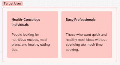
|
| Fig.1.3.2 Initial Target Users |
- Health-Conscious Individuals: People looking for nutritious recipes, meal plans, and healthy eating tips.
- Busy Professionals: Those who want quick and healthy meal ideas without spending too much time cooking.
- Student: Student who wanted to eat healthy, but has no time to cook.*
- Parents: Parents who wanted to search for healthy meal inspirations and recipe for their family.*
Fig.1.3.2 Design Thinking Process
4. Research & User Insights
Next, we carried out research, user interviews and surveys to confirm our assumptions.
Fig.1.4 Research Findings
As part of the user research phase, I was responsible for designing the interview questions for both physical interviews and the Google Form survey. This step was crucial in gathering insights into our target users’ eating habits, challenges, and expectations regarding a healthy eating app.
To ensure a well-structured and effective research process, I crafted two sets of interview questions:
- Google Form Survey Questions: The survey was designed to collect quantitative data from a larger audience. Questions focused on eating habits, meal planning struggles, food ordering preferences, and interest in a health-focused app.
- https://docs.google.com/forms/d/e/1FAIpQLSe9k5lGY1wHNFsLNaGkossl0FIianyrglMBjWXJAqnpnKtQcg/viewform
Fig.1.4.2 Google Form Questions
- Physical Interview Questions: These were more in-depth and open-ended, allowing us to gain qualitative insights into user behavior, motivations, and pain points.
Fig.1.4.3 Interview Questions
Following the preparation of our interview questions, each group member conducted physical interviews separately to gather qualitative insights from potential users. To ensure we had a diverse range of perspectives, we needed a total of at least 12 interviewees per group, meaning that each member was responsible for interviewing three individuals.
We asked open-ended questions to encourage participants to share their personal experiences, such as their struggles with maintaining a healthy diet, their use of existing meal-planning apps, and what features they would find most useful in a new platform like Zestoria.
Below is my interview transcript, detailing the responses and key takeaways from the three interviewees I spoke with.
Fig.1.4.4 Interview Transcript
After collecting responses from our Google Form survey and conducted interviews, we analyzed the data to identify key insights about our potential users. The findings provided valuable information on their demographics, pain points, and expectations, helping us refine Zestoria’s features and adoption strategy.
Findings from Google Form Survey
- Target Audience: Primarily young students (18-24) with mid-range budgets, looking for quick and affordable healthy meals.
- Pain Points: Lack of time, high costs of healthy food, and limited meal options.
- Opportunities: A one-stop app with nutrition tracking, budget-friendly meal plans, and community support can attract users.
- Adoption Strategy: Since most have never used similar apps, a simple UI, educational content, and incentives (discounts, challenges) can increase engagement.
Fig.1.4.5 Google Form Findings
Findings from Physcial Interview
- Challenges: Limited healthy options, high costs, and lack of variety in restaurants and delivery services.
- Opportunities: Strong interest in a one-stop app for meal recommendations, calorie tracking, personalized plans, and food delivery integration.
Afiinity Diagram
Each team member created an affinity diagram based on their physical interview findings:

|
| Fig.1.4.6 Affinity Diagram |
5. Key Features & Unique Selling Points
After gathering user feedback, we classified the initial main features and unique selling points for Zestoria:
Fig.1.5 Initial Key Features & Unique Selling Points
6. Final Submission for Task 1
Fig.1.6.1 Figjam Board
- Individual Work Progress
- Presentation Slide
Fig.1.6.3 Task 1 Presentation Slide
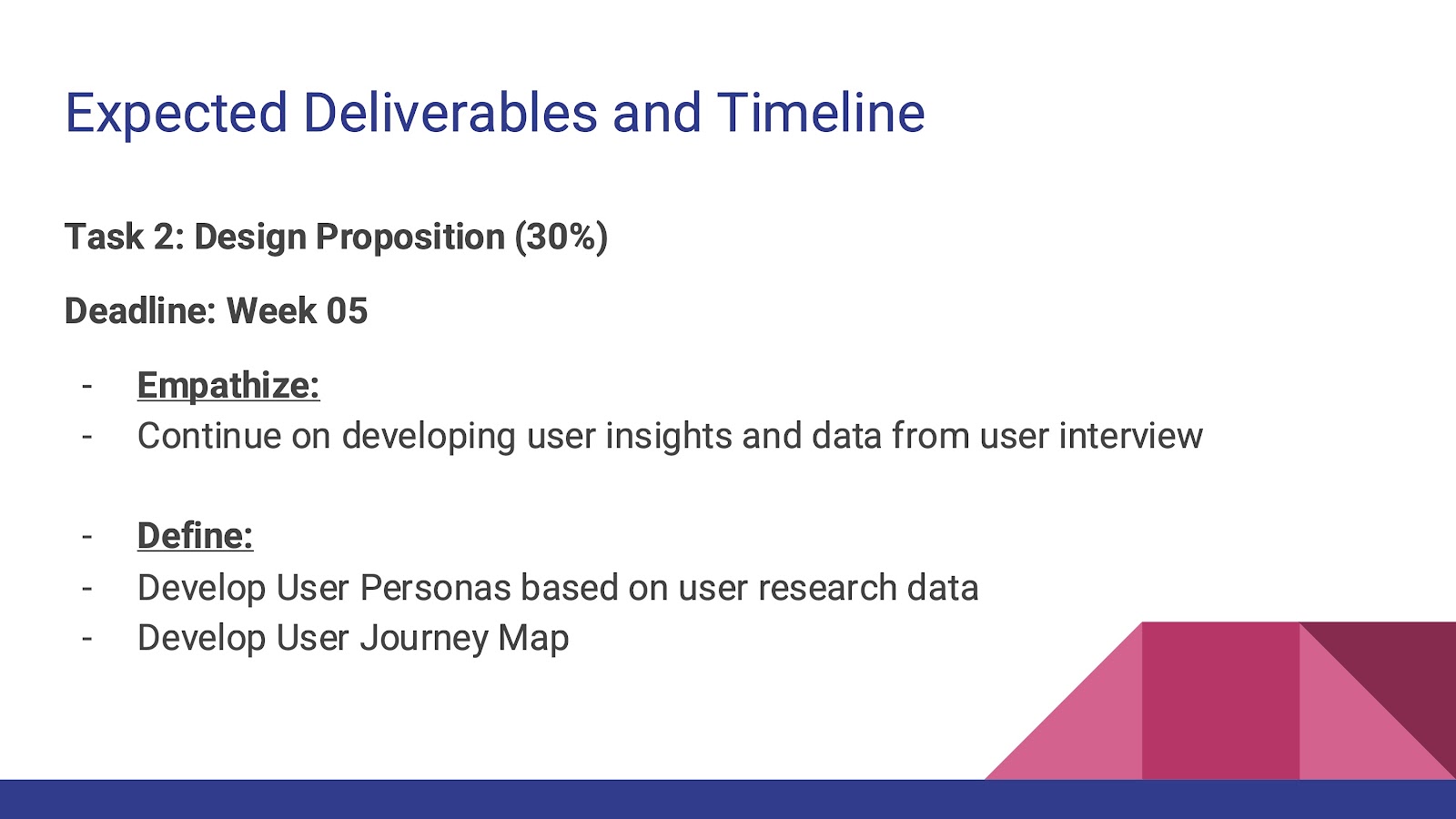
Task 2: Design Proposition
1. Instruction
- Continue on developing user insights and data from user interview
- Develop User Personas based on user research data
- Develop User Journey Map
|
| Fig.2.1 Expected Deliverables and Timeline for Task 2 |
We proceeded to define the user experience after developing a solid research base. This phase involved structuring Zestoria's user flow, creating essential features, and guaranteeing a seamless user experience. Our strategy focused on convenience, customization, and engagement with communities.
2. Empathy Map
To better understand our users, we created empathy maps for each target user. This helped us analyze their thoughts, feelings, and behaviors when it comes to healthy eating. By mapping out pain points and motivations, we gained a clearer idea of how to tailor Zestoria to meet their needs.

|
| Fig.2.2 Empathy Map |
3. User Personas
Based on our research, we developed four user personas representing our target audience:
- Students
- Fitness trainers
- Busy professionals
- Parents
These personas helped us define how different types of users would interact with the app, what features they would prioritize, and their overall goals.
Fig.2.3 User Personas
4. User Journey Map
We then mapped out each persona’s journey in using Zestoria. This included:
- Discovery Phase: How users find Zestoria and what attracts them to try it.
- Engagement Phase: Their interactions with the app, including meal planning, tracking nutrition, and ordering food.
- Retention & Growth: How the app maintains user engagement through features like expert-led content and community engagement.
Fig.2.4 User Journey Map
5. Card Sorting
To organize information effectively, we conducted a card sorting exercise. This helped us determine how users expect content and features to be structured within the app. The process allowed us to refine the navigation, making it more intuitive and user-friendly.

|
| Fig.2.5.1 Card Sorting |
https://study.uxtweak.com/cardsort/QW2XIQw3Vwu2RtOynn9cw
| Fig.2.5.2 UX Tweak Result |
6. Final Submission for Task 2
- Presentation Slide
Fig.2.6 Presentation Slide for Task 2
Task 3: Concept Presentation
1. Instructions
- Group Work
- Brainstorm ideations using storyboarding, sketches etc.
- Design inspiration from other design resources/websites for ideations
- Develop Information Architecture (i.e. Card Sorting Method) for your proposed solution
- Develop User Flow/Work Flow diagram
- Create Design Guideline (colour scheme, typography, UI component etc) that is related to the project topic and targeted user personas
- Individual Work
- Initial Lo-fi prototype (sketches or wireframe)

|
| Fig.3.1 Expected Deliverables and Timeline for Task 3 |
2. User Flow Chart
To visualize how users would navigate through Zestoria, we created a user flow chart. This step helped us identify the most intuitive pathways for discovering meals, customizing meal plans, ordering food, and engaging with the community. Refining this flow was crucial in ensuring a seamless experience for users.

|
| Fig.3.2 User Flow Chart |
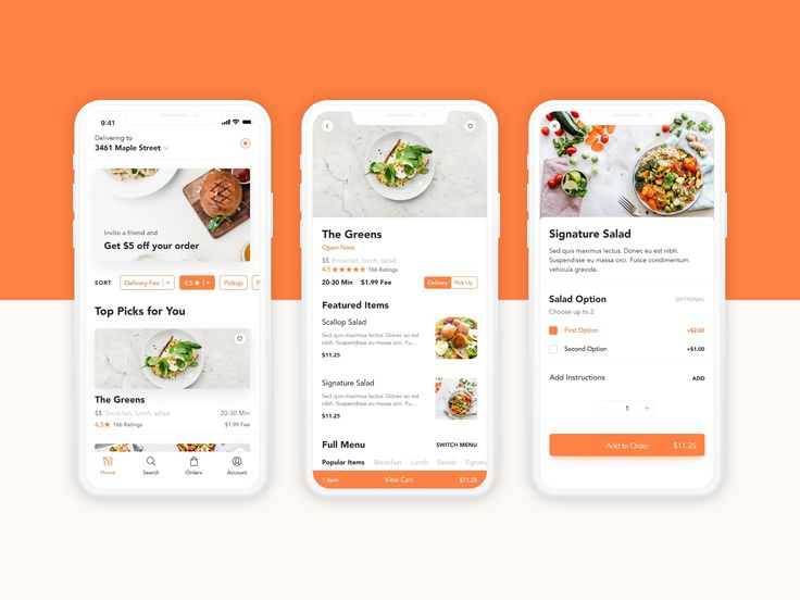
3. Design Inspirations
Some good examples of UI design were found on Pinterest as visual references.


|
| Fig.3.3 Design Inspirations |
We focused on developing a strong visual identity to ensure Zestoria’s interface was both aesthetically pleasing and functionally effective. The key components included:
- Colour Palette - A fresh, vibrant selection of colors representing energy, health, and well-being.

|
| Fig.3.4.1 Colour Palette |
- Font Selection – Clean and modern typography that enhances readability and user experience.

|
| Fig.3.4.2 Font Selection |
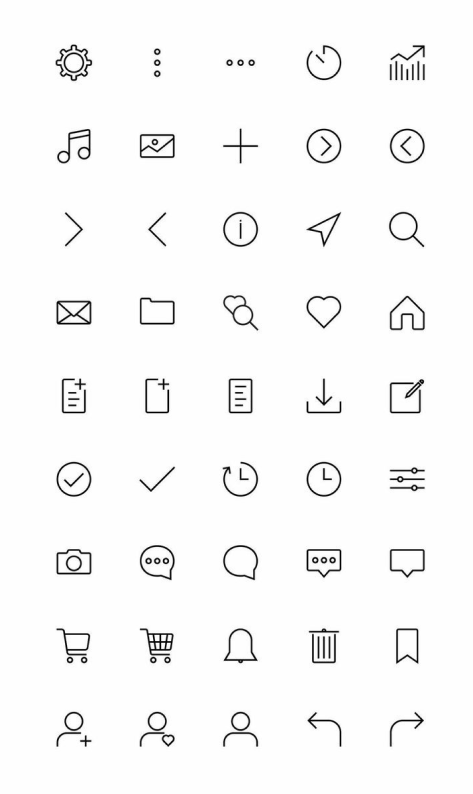
- Icons – Custom icons and graphics to create a visually engaging and intuitive navigation system.

5. Monetization Strategies
To keep Zestoria running while providing value to users, we explored different ways to generate revenue. Here’s our monetization plan to support the app’s growth:

|
| Fig.3.5 Monetization Strategies |
Once the user flow was finalized, we began sketching wireframes for the app's core pages individually. The lo-fi prototype served as a foundation for testing layout structures, navigation, and content organization before adding high-fidelity visual elements.


|
| Fig.3.6.1 Lo-fi prototype design process |
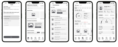
|
| Fig.3.6.2 Overview |
Fig.3.6.3 Figma Lo-fi Design
7. Final Submission for Task 3
- Figma Prototype: https://www.figma.com/design/VvH7BJXFHkppkKd7H4DSUR/Major-Project-1-Lo-fi?node-id=0-1&t=1JKGKYcuX8RB9v4E-1
Fig.3.7.1 Figjam Board
- Presentation Slide: https://www.canva.com/design/DAGiDsxj6Vo/s934qgiju_bqJQTRwf4OmA/view?utm_content=DAGiDsxj6Vo&utm_campaign=designshare&utm_medium=link2&utm_source=uniquelinks&utlId=h8c2e0aa013
Fig.3.7.2 Presentation Slide for Task 3
Feedbacks
Our initial idea, a Kid’s Learning App, was not recommended as it lacked unique features and engaging interactions to enhance user experience. We were advised to conduct further research and explore ways to improve user engagement.
After presenting additional progress and app features to Mr. Razif, he pointed out that the app still lacked an innovative approach to delivering lessons. However, our alternative idea, a Healthy Meal App was approved.
This week, we consulted Mr. Razif regarding our progress on physical interviews and the Google Form survey.
We were advised to create user personas based on our target audience and to integrate findings from both the physical interviews and survey results to develop a comprehensive user journey map.
Task 2 was successfully completed.
We proceeded with the development of the low-fidelity prototype. Each group member was required to design their own version, allowing for different UI design preferences.
We conducted our physical presentation in class. The meal planner feature received positive feedback for its usefulness. However, we were advised to add the following features to enhance the app:
- Goals Feature: Allows users to set personal goals, such as losing weight, gaining muscle, or maintaining a healthy diet.
- Nutritionist Consultation: Provides one-on-one live chat with licensed nutritionists for personalized meal planning recommendations.
Reflections
Major Project has been a challenging but rewarding experience. It gave me the chance to go through the full UI/UX design process, from understanding the problem to creating a solution. Through user research, I learned that many people struggle to maintain a healthy diet because they have to use different platforms for meal planning, nutrition tracking, and food ordering. This showed us how important it is to create a simple and user-friendly solution that combines everything in one place.
Turning research into user personas, journey maps, and wireframes helped us design an app that truly meets user needs. Brainstorming different ideas and sketching layouts allowed us to explore multiple options before choosing the best one. One of the biggest challenges was balancing looks and usability—we wanted the app to be visually appealing but still easy to use. Getting feedback and making changes along the way helped improve the design.
Working in a team also taught me a lot about communication and time management. We had to coordinate tasks, share ideas, and make sure everyone was on the same page. Keeping up with deadlines and making sure everything was completed on time was an important part of the process.
I really appreciate my teammates, Jun Ming, Xiang Lam, and Jie Xuan, for their effort, creativity, and dedication. Their teamwork and commitment made this project both smooth and enjoyable. A special thanks as well to our lecturers and supervisor, Mr. Razif, for their guidance, valuable feedback, and support. Their advice helped us improve our ideas and strengthen our design approach.
Looking back, this project has improved my problem-solving and design skills. I learned how to analyze user needs, turn them into design solutions, and create an easy-to-use interface. Moving forward, I want to continue improving my prototyping and usability testing skills to make sure my designs are both useful and engaging. This experience has made me even more passionate about UI/UX design and excited for future projects.


Comments
Post a Comment